THE MBENG'S
Brand & Content Lookbook · v1 · July 2026
Silent N Production
Brand & Content Lookbook · v1 · July 2026
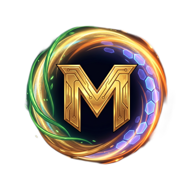
Silent N ProductionThe mark is the gold circuit-engraved M inside a ring woven from the five siblings' powers — vine green, holographic gold, earth amber, speed orange, hex-light violet-blue. It is used alone, without a wordmark, and always from the transparent master file. When the show name is needed, set “THE MBENG'S” in Fredoka SemiBold beside or beneath it.
Five power colors — one per sibling — carry all the fun. They sit on a warm, grounded base (cream, clay, night) so the brand stays structured, not chaotic. Rule of thumb: base does the layout, power colors do the talking.
The five-color “power ring” gradient (gold → green → blue → violet → orange) is a signature element: use it as a 4px seam on section edges, video end-cards and thumbnail borders — never as a full background.
Titles, thumbnail text, character names, buttons. Never for paragraphs.
Everything readable: body, captions, UI, subtitles. Fallback stack: system-ui, sans-serif.
Corners: cards 1.3rem · media 1.2rem · pills fully round (980px). Buttons: pill-shaped, Fredoka/Jakarta 600, Sunset Clay primary, Speed Orange for “watch/play” actions.
Vertical video leads discovery. Every clip carries three brand locks: the emblem top-left, a Fredoka hook with one gold word, and the power-ring seam on the end-card.
The Mbeng'sThe Mbeng's
EP 1
POWERS
New episode every Friday · Shorts Tue & Thu